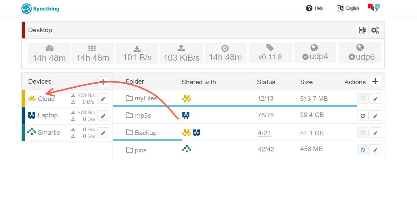
boxed layout for local device info:
what do you think? this would be easy to scale to small devices too.
boxed layout for local device info:
what do you think? this would be easy to scale to small devices too.
What about colored identicons? As you said, colors work with any shape you want.
Best of both worlds:
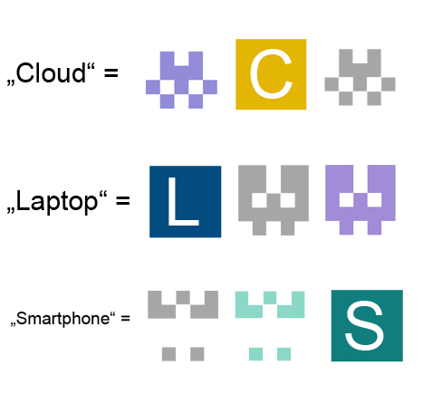
It’s also pretty easy to generate colored identicons, with the same color on every device (based on the device ID).
yes I know them - but don’t you think the first capital letter wouldn’t be unambiguously? (who came up with such a word? oO ) the colored box with the first letter combines the real name of the device (by first letter) and the color, which is also used next to the local devices name and as contour of the navbar…
for example: you have two devices with similar colors, the identicon would not really help I think…
The only problem is that the device name can be set differently on every node. So it might be confusing in some cases.
So I’m not really sure, just wanted to say that identicons don’t have to be grey 
I know  that’s why I hope that we could change from identicons to color & first letter
  google is using this not without any reasons
next try:
aaand:
I think you’re missing the point. As Nutomic said:
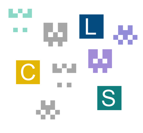
So the icons may not be consistent across all devices, which may be confusing.
ahh - true
one thought: wouldn’t you name one device the same way?
if there are several people using syncthing and syncing to one central device, this should not be a problem - they only see their own given name and the color set by this device. right? 
And also: I call my Nas: “NAS” but my friend calls my Nas in his Syncthing completely different, i guess…
hmm well I see.
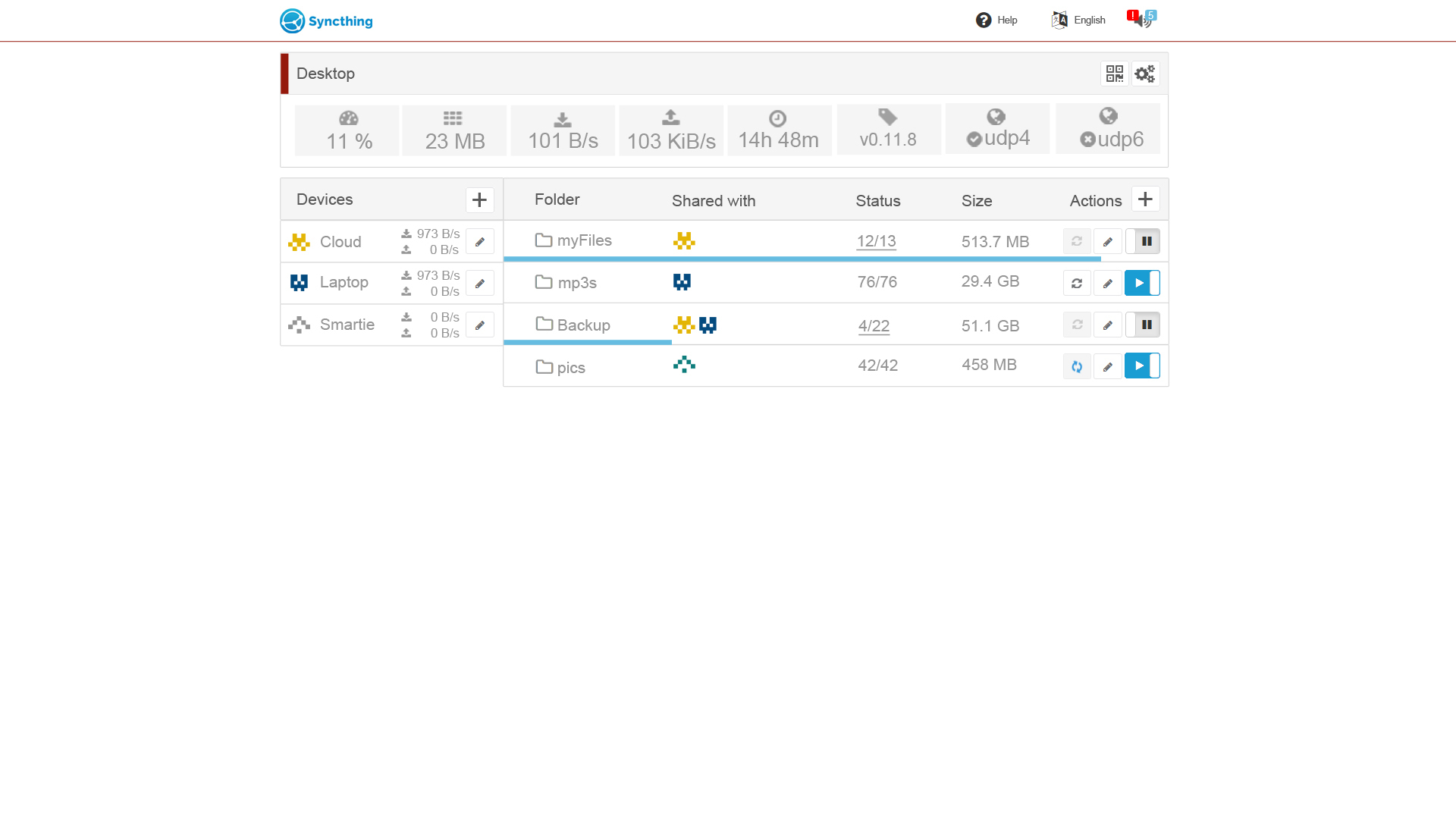
Update 09.07. (see pics above) Changelog
todo:
@sgilani: what do you think?
Thank you for your update!
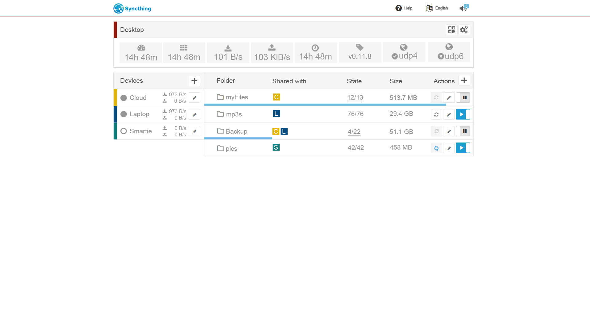
My I ask you to include the identicons also for the devices side? Something like this:
let me think about - this could get a bit narrow on the devices side… these circles were a indicator for online, offline etc… so cant’t replace them without substitute…
long time, no update
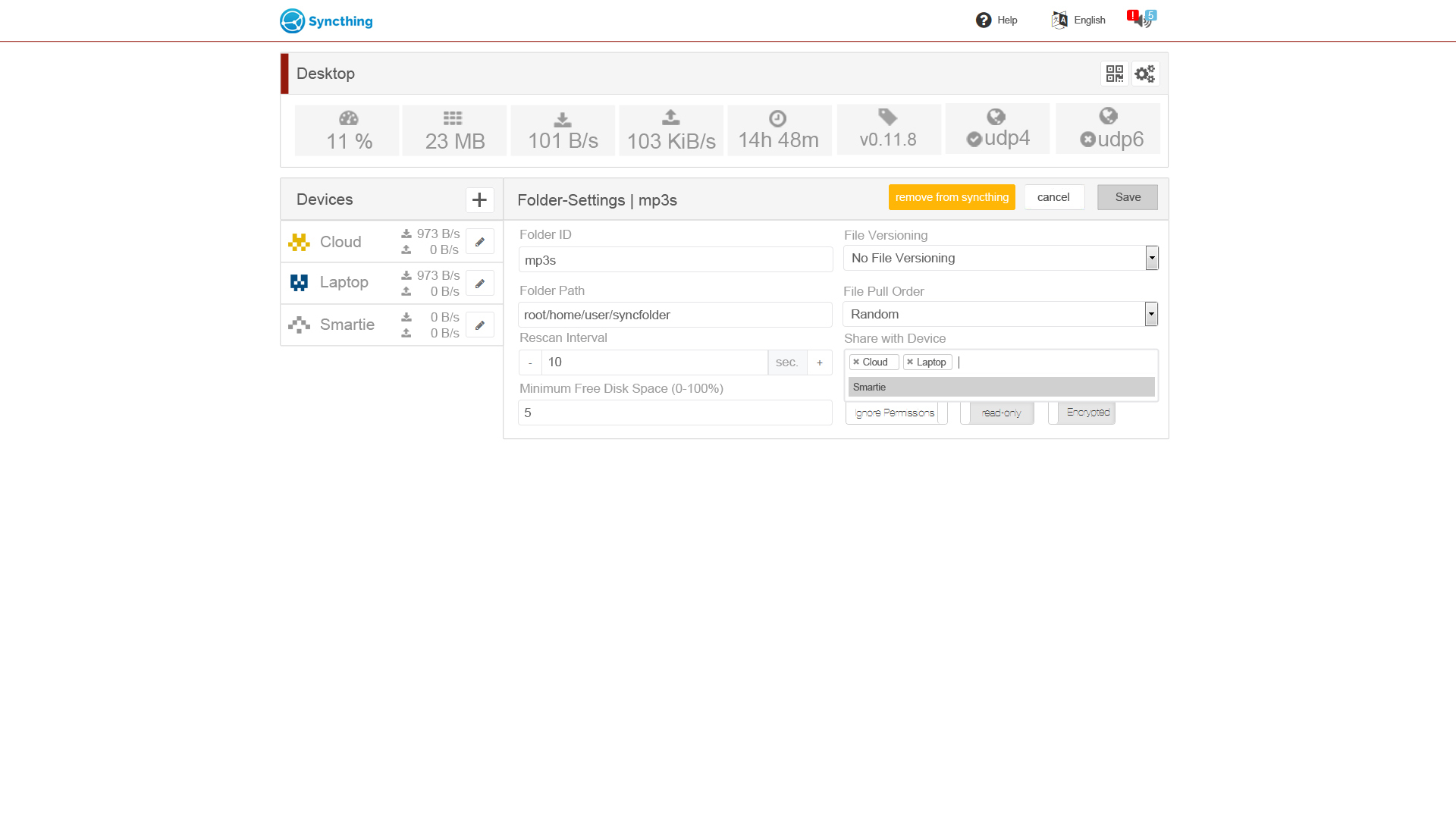
just added some hopefully upcoming(?) features to the
Is there a way to use this layout in syncthing now?
unfortunately not  unless you are able to develop this piece of code
oO is there anyone who has the leisure to do this for us? 
Maybe the devs could start a small crowd-sourcing campaign in kickstarter or similar