Also, how does it scale to small screens? Will it work on my phone?
Hi Eddy2909,
i would like to see, that you get in touch with one of my bootstrap GUI developers to change the GUI, but please at first prepare also some design for Bootstrap XS SM MD LG (LG you had already) 
1 Like
sure - it should!
What will that look like?
give me some days 
1 Like
there are no dropdowns for adding devices & folders
yes but its beautiful 
this would be probably to long on little devices
agree
agree
good question will fix it!
tnx
agree - couldn’t find the icon syncthing uses.
let me think about it… 
ok
This image:
I’m not sure what you mean by that. See for example GitHub’s little ‘copy to clipboard’ icon next to every commit it displays.
It’s the icon-tag icon here: Bootstrap Glyphicons
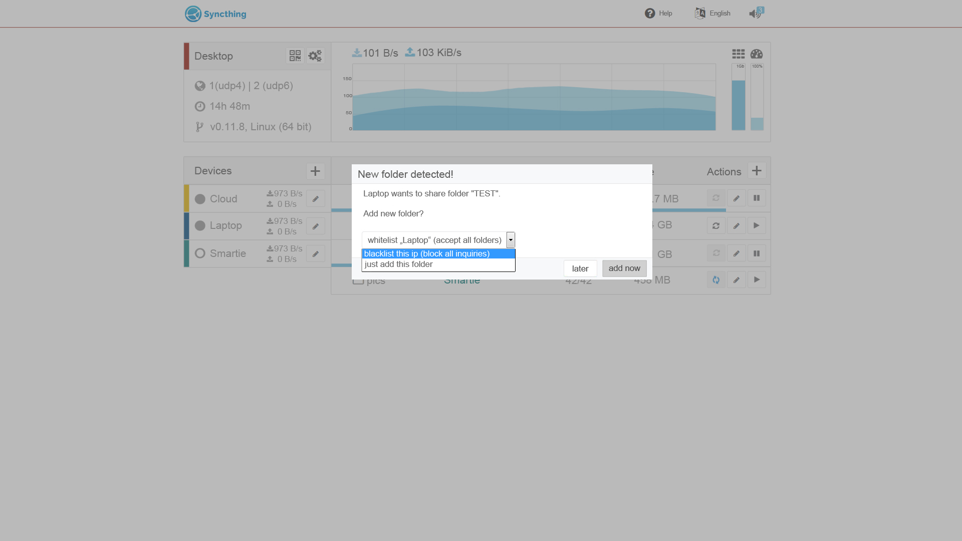
I see. you’re right - it’s not clear enough. There would be some combinations possible, that wouldn’t make sense: “blacklist” & “add device” but by changeing the button text to “ok”, it would make sense and would give following combinations: “whitelist” & “ok” “blacklist” & “ok” “just add” & “ok” “later” & “ok” only to give white- and blacklist as options, it would be difficult to explain what it means / the button text would be too long or what do you think? any other ideas on that?
I tried not to use hover blobs because smartphones won’t display them.
tnx 
I think you misunderstand. I mean have buttons saying “Later”, “Just This Folder”, “Whitelist”, “Blacklist”.
This thing!
I’ll try it with the next update
I’ll try this too
all mockups are designed to be coded with bootstrap and a good grid “policy”  but give me some days… I’ll make some responsive mockups.
update 07.07. added S & M Version 0.1
used display sizes: S: 540x960 M: 1024x768 L: 1920x1080
ToDo’s:
- add advanced settings “box” (cxl for grandmoms https://github.com/syncthing/syncthing/issues/1381#issuecomment-119741323)
- add copy to clipboard icon (done)
- rethink add folder & add device (done)
- delete all not yet developed features (done)
- rethink restart prompt (& delete white- &b lacklist feature) (cxl not developed)
- change filesync indicator color (done)
- add arrow boxes to numeric fields (done)
- fork > version icon (done)
- use one(!) icon “framework” for consistency
- add anddroid like identicons to filesync view (cxl My thoughts for a GUI 1.0 | looking for a frontend developer :))
- add colored identicons (done)
- change order devices >< folders on small devs (done)
I’d actually suggest switching the position of everything across the center:
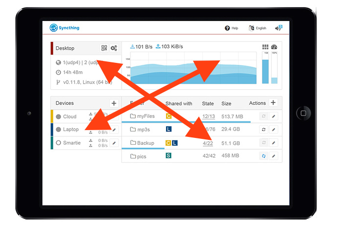
The reasoning being that the most important stuff should be at the top and left (I know the left-right part is cultural, but still). The most important thing to me is the status of the various folders, then that of devices, then lastly discovery details and resource usage of various kinds…
It still feels a bit cramped to me…
I agree with the cramped - I would prefer a space between the left and right, like there is between top and bottom. I also feel the network graph is too prominent. Just by 2 cents.
hey guys,
I choosed this layout out of several reasons:
- it should feel a little bit like a “admin panel / dashoard”… I have not seen any dashboard with a “menu” on the left side so far oO (and most of clicks will be on the right side (folderview) / best for the right handers
- the part above shows where you are / the local machine info (for orientation)
- the part below shows what is happening in the network
- the important thing: the part below linkes the folders and devices - thats’s why I wouldn’t add spaces between the “boxes”
- this part is the only one who could get longer and longer depending on your devices and folder list. If we change the order and you add let’s say 10-15 devices and 20 folders you couldn’t see the local info at all

- I will rethink the part above - it’s indeed to big.
Please do not throw away the device icons.
It is a very quick way to recognise a device when you are working on serveral different computers.
Humans may better recognise “where” they are by colors than with forms…
lets test it - try to remember the devices:
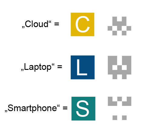
so now: which icon stands for which device? whithout cheating 

a second and a third reason is:
- recognising by colors works unconsciously - you wont need to use your brain
- using colors for designs is much easier because I can use the color in any form I need to
1 Like
For me, these icons look like: The Mask, the Animal and the King. They are calculated by the IDs, so they are on all webinterfaces the same.
I can change the name of the device freely (and I do, “Moms PC” on my PC has a different name on my girlfriends pc)
If the color can different on all pcs, too… Difficult.
maybe we could generate a color out of the identicon data - better: we would change identification to colors / rbg or hex data. (@calmh) otherwise you have to setup a color on every device.