difficult with this layout  But I’ll keep it in mind
@Updated 21.06.2015 (watch above)
- whitelist ip’s (future feature?)
- blocklist ip’s (future feature?)
In my mind, this
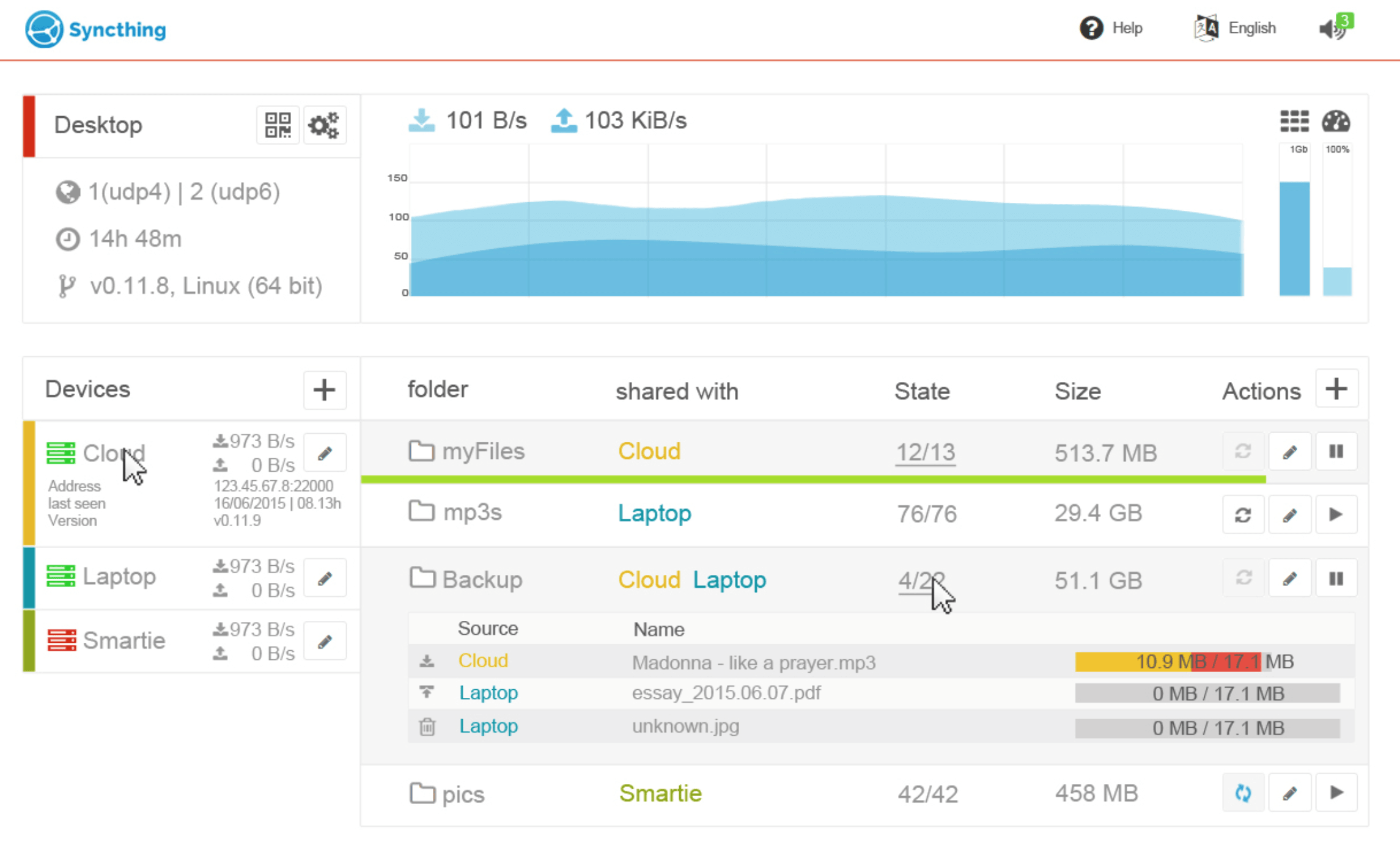
is rather more cluttered than the current
with perhaps too many different colors and bars and too small text. The previous suggestion
is also colorful but doesn’t attempt to cram as much information into a single screen (something the current UI also suffers from btw).
As an aside, I would suggest not including too many elements for features that don’t exist - if someone actually tries to implement this UI, that will need to be removed or wait for the features in question to exist… 
3 Likes
you’re right - its not yet flat at all 
but within the previous suggestion some imho important things were not layouted or are missing:
- folder >< device connection (which folder is shared to which device)
- which device up- or downloads from which device (current sync)
- button usage isn’t consistently (one button on top - one button below/ once there is a edit-button once not)
- progress on syncing (if using a responsive design, there can’t be a “hover” blob)
- global/local (same as above)
- progress overall/total (missing)
- filesync-details (missing)
once all these infos will be layouted, it will not be as clear as it is now I guess…
but these “missing links” were the reason to layout another gui. honestly I need to get it flat - but first of all, I always worry about the features and then about the final layout.
maybe “truth lies in the middle” as usual  and it’s probably not the final version
I’ll make it flat in the next versions 
update 22.06.: (watch above)
- rework colors & forms (get it flat)
- “edit device” beside devices (better mobile usability - less modals)
update 22.06. II (watch above)
- added settings, device edit & filesync-details to the right panel (better mobile usability - less modals)
update 23.06. (watch above)
- added folder-settings (finally )
Hello !
All this is so appealing to me! I know it’s a WIP, but is there a way to “test” one of these UIs ? None of them seem too colorful for me.
I would love to get it developed - but my html, js / angular and css knowledge are - let’s say - rusty  I’m still searching for a developer, who could code this piece of code
Labelling potentially interested frontend developers as “geeks” probably won’t help your cause ![]()
oh *******  just translated it into german…
in german it’s not negativ to call someone a geek and
to be honest I would call myself a junior geek (german version!!) too
just translated it into german…
in german it’s not negativ to call someone a geek and
to be honest I would call myself a junior geek (german version!!) too  in german geeks are technically minded people, who are always up-to-date using new technics…
let’s say: I’m searching for a Pro to develop this for us
in german geeks are technically minded people, who are always up-to-date using new technics…
let’s say: I’m searching for a Pro to develop this for us
just opened up a rep:
Everyone is invited. It would take too long if I would do it (alone) - and the results would be 
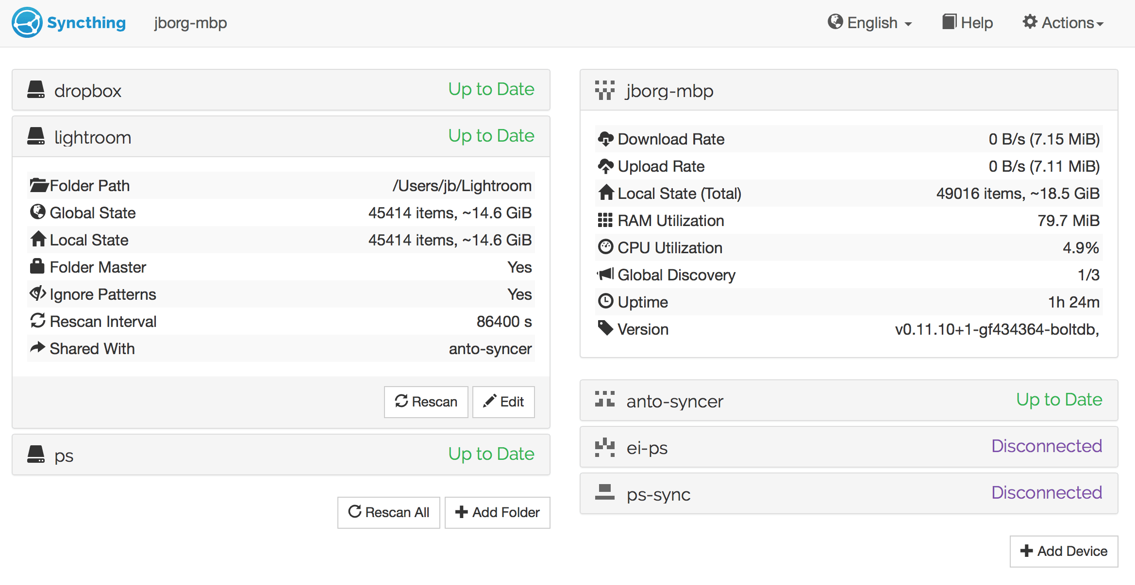
Update 29.06.15 added “iPhone-like” switch / toggle buttons to:
- folderview
- device-settings
- foldersettings
Where do we find these updates?
in the pics above  I always update the “old” pictures…
Ah. That wasn’t obvious.
1 Like
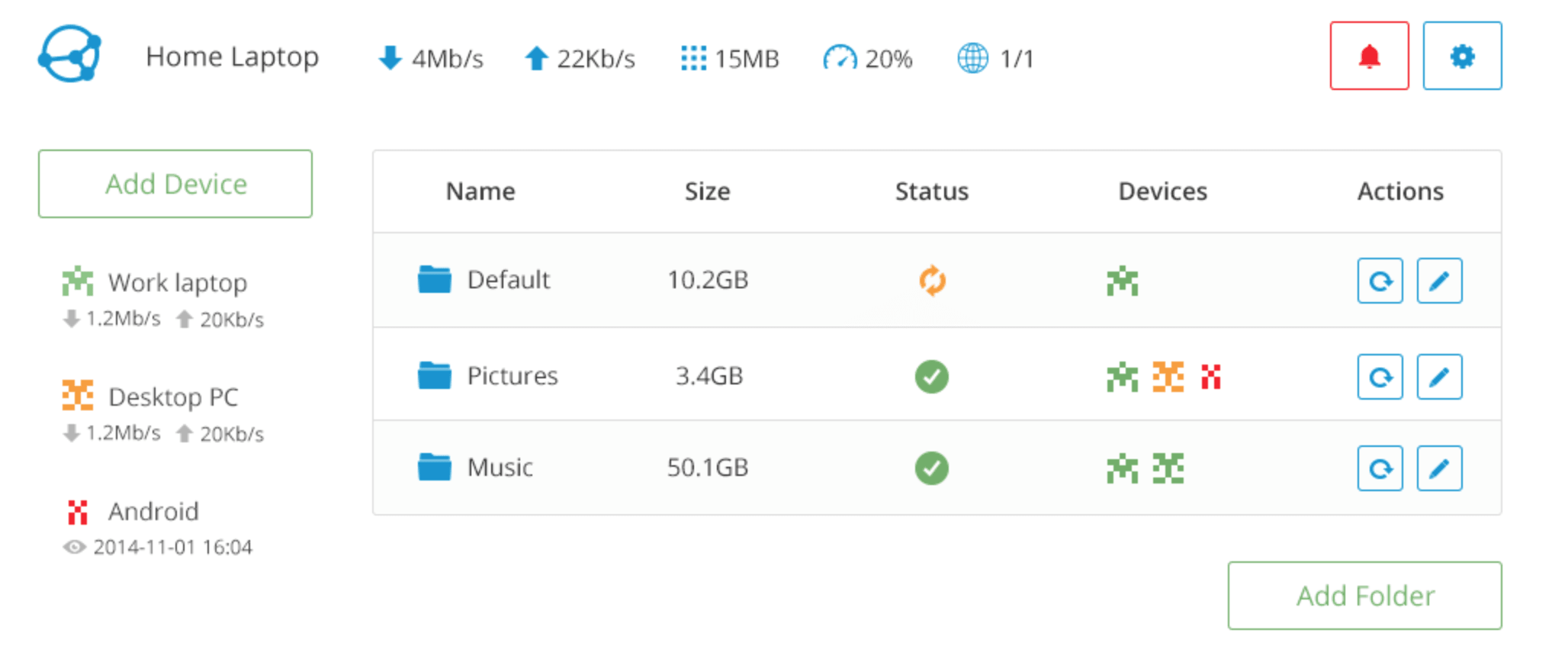
I guess the Names below “Shared with” doesnt scale very well if there are too many Hosts (like 10 or so)
1 Like
yes I know - but I have no solution for this for now… coming soon 
Update 06.07.2015 (see pics above)
- added “advanced” settings (button)
- added android contact-like identicons to folderview (thanks to @fti7)
- fixed settings view
Random thoughts:
- I don’t like the drop-downs for adding new folders/devices. Since there are only 2 options available, why not have 2 buttons?
- The network graph takes up a huge area of the screen, by comparison with everything else
- The ‘Action -> copy to clipboard’ on the Device ID seems a bit pointless. Why not just have a button to copy straight to clipboard?
- The Reused/Copied from original/Downloading/etc colours on the ‘Sync-Details’ page are too similar. People with forms of color blindness especially are going to hate you here, but as a color-seeing person I have to keep cross-referencing the colors against the key.
- The ‘restart needed!’ dialog is going to get annoying. Fast. What if you want to change a bunch of settings, then restart once afterwards? You’re going to have to click ‘later’ a bunch of times, and it’s going to piss you off.
- Why is there a ‘GUI Authentication User’ under ‘Folder-Settings’?
- Some numeric boxes have little < and > arrows, but others don’t.
- The icon you’ve used for the Syncthing version means ‘fork’, not ‘version’
- The options to shut down / reboot Syncthing are really hidden.
- I’m not a fan of the toggle buttons