Note that this is still missing a distinction between TCP and QUIC for WAN. We might want to include this information but i’m open to suggestions how to do it without confusing the user.
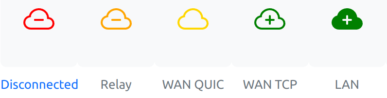
I like those icon choices, although it starts looking a little cluttered / chaotic with them being very non-uniform.
The TCP / QUIC distinction is really just a technical detail and is now available under the separate “Connection Type” row. Not really much to gain by seeing this distinction on first glance in the overview, or is there?
I’d say the icons are interesting, but aren’t some of then already used in the GUI for different things? The cloud is used for “Sync Status”, and the last one for “Listeners”. Ideally they should be unique to avoid any confusion.
Personally, I like the current ones though. They are uniform and simple. Even if they are changed, I wouldn’t be surprised if people come and complain about the new ones as well.
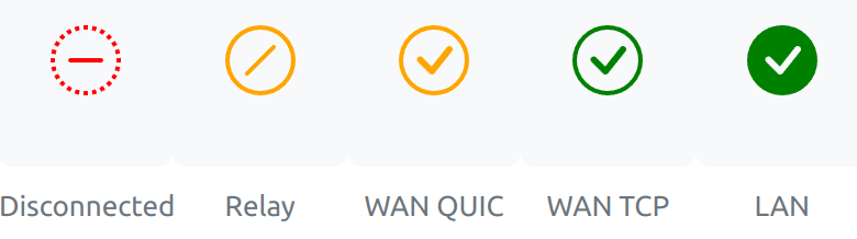
In my opinion the suggested icons are chaotic. There needs to be unison. A common theme. That’s why I like the numbers or the circles in the bootstrap icon set. For example:
I like both the circle and cloud versions, but in terms of accessibility, the circle icon set works better for a wider audience if/when the text labels aren’t always visible.
The red and orange cloud icons can appear similar in color with various forms of color blindness. Their circle counterparts with a horizontal line for “Disconnected” and diagonal line for “Relay” don’t rely only on color.
Although the orange and green icons for “WAN QUIC” and “WAN TCP” use the same symbol/glyph, the colors are still distinct enough to be usable.
I think that if we decide to refactor the icons, we should start from the base. And the base would be, in my opinion, deciding (perhaps again) what types we want to distinguish.
We can all come up with different icons, but as long as there is also a discussion regarding what the relevant types are to keep apart - we should probably get that straight first. And I also tend to agree that using completely different icons tend to be chaotic.
That the current icons aren’t ideal, I agree. But color coded icons, numbers, non-filled and filled icons all do lead to the exact same issue; wondering if a certain type/icon is “worse” than the other. Something the discussions seem to be revolved around.
I think that QUIC is good enough for WAN at this point, if not preferable to TCP. It’s also a very technical distinction and hard to express with an icon as it boils down to “similar but different”.
My proposal:
Disconnected
Relay
WAN
LAN
It’s easy to explain these types and they represent clear levels of performance increments:
relay bandwidth <= WAN bandwidth <= LAN bandwidth
The next level is always the upper bound for the previous one.
They also provide just enough information for supporters to troubleshoot based on a screenshot.
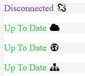
There is also another issue, which is that with numbers and/or other fancy symbols, the new user won’t have any idea what they are related to. The current ones at least are clear in the fact they are about networking (even though, as seen in some of the comments/questions, some may confuse them for Wi-Fi and such ).
I think it makes sense to show the different types of connection. But I think it’s bad when it is said that a connection type is good or bad. If a connection is only possible by WAN, it should not be indicated that there is a problem with it. So I suggest to show the status without ranking like it is now. The only “bad” connection type can be “Disconnected”, all others have different speeds and maybe connection reliability, but every connection can be good, depending on infrastructure or condition.
If you read the original issue, the main idea/problem behind the icons was that the user wanted to have their devices connected through LAN, but in reality they misconfigured something and because of that Syncthing was only able to connect through a relay. As such, the icons were supposed to provide such information in a glance, so that the user could be sure that the connection used was the right one.
If you are a power user or network administrator and you configure your devices to connect in a specific way only, then obviously the icons won’t be very useful in such a case.
Showing just the connection type without its “strength” is of course a possibility, but the question comes then how to do it so that a non-technical person will be able to understand the meaning. Please keep in mind that for such a user even the acronyms like LAN, WAN, etc. is just a technical jargon which they can’t comprehend.
Well, you might not be able to change the type but the rating is still valid.
We can’t express “device XY is connected as expected” without storing the expected connection type per device. As these expectations might change based on the current location of devices…let’s not open that can of worms.
Neutral icons would solve that but look more chaotic as discussed earlier.
And we shouldn’t. The last three points are all the direct result of the connection type being used. We can’t influence bandwidth, latency and packetloss.
Well, we currently don’t really label a connection as good or bad. I believe the most firm words we currently use is that a certain type of connection is considered ‘suboptimal in most cases’, which may or may not be out-dated. Otherwise it simply states what the type is. No value or quality-label attached to it.
As I understand, the confusion starts because we all are quite used to seeing the ‘signal’-icon as WiFi/connection-strength indicator, where less bars is of course worse than more bars.
But that is not the case here. There is some correlation between the connection type and global/default preferability, which is the base of the signal-icon-level of choice. But in the end this preferability does depend on personal use-cases and situations. There are use-cases to think of where each and every type is considered optimal. I don’t think we can handle this in a very realistic way and if so, this lies beyond the scope of this icon or related issue.
For any advanced user in specific situations these connection-type-icons may not mean very much regardless of which ones we use, or at the very least a different icon (for example level-2 instead of 5) will be the optimal one. And we also should not pretend like this icon will do more than it is supposed to. All the information which this icon is supposed to represent was already available in the details-pane, this icon exists merely for convenience - to quickly see the used connection per remote device without having to fold open the details-pane.
And for all this, different icons may be preferable. But if so, I have yet to see a suggestion with a significant improvement without making it more unclear in a different area.
Whether we need to separate QUIC is a good point. I’m not sure if it adds much, but there was some consensus about this before.
Probably QUIC (the implementation we use) is getting better and better so the difference compared to TCP under favourable circumstances gets smaller. There are of course circumstances where QUIC will perform better than TCP, and there are also things we could do to use QUIC better. For most cases it’s probably about equivalent to TCP.
I agree with this summary.
I don’t particularly care whether we indicate the results with number of stars, WiFi connectivity icons, or funny emojis. Enough other people care about it that I’m sure the decision gets well cared for
Shouldn’t we take a step back maybe?
This is a prominent UI change. I don’t think you will ever be able to make a prominent UI change without someone (or a few someones) disliking it. They are also more likely to voice that than everyone that’s just fine with it. So:
Is there actually a fundamental issue with the currently used icons?
That’s should also be discerned from the need or not for the quic-tcp-distinction and similar - that’s an orthogonal concern.
My opinion is the bars are perfectly fine. Just because they have one prominent use (cell reception) doesn’t mean they can’t be used in any other way. That’s not to say there may not be better icons, but none of the ones seen so far seem better to me. Nor do I see it as pressing to replace the bars - which obviously is just my 2c.