It’s easy to discuss the easy things, so the easy things get a lot of discussion.
1 Like
I cannot tell if that’s fundamental enough, but I believe that the current design is too misleading, and in several ways at that. People who don’t know the reasoning behind those icons, will draw completely incorrect conclusions after seeing these bars.
Particularly, 1) that one bar normally means the device has barely any connectivity, while in our case it just means the relay connection, which is perfectly fine and stable and normally not even too slow; and 2) that WAN/LAN connections are drastically, several times better than relay or QUIC, which is obviously very far from the truth.
I do like the topic-starter’s approach with neutral icons. They are recognizable enough, so that even non-tech persons should be able to get a general idea. And they do not imply that relay connection is almost the same as no connection at all, which the bars seem to designate.
1 Like
In fact we are not indicating different levels of connection quality (as in speed), but rather all we know is the network distance. That’s why the summary by @bt90 is spot on.
LAN (as we currently identify it by private IP ranges) is close because no router can be involved (of course there are rare special cases where this is untrue). We could actually try to get this more precisely by comparing source and destination IP (where to get netmask?) or even fancy hops counting like the traceroute algorithm does…
WAN implies by its definition a wider area, thus greater distance. Routers are involved, usually varying (and slower because of aggregation) links. But it’s still all on the network transport layer.
Relays in contrast work on the application layer. For most users (do we have stats?) the relays are from the public pool, thus two WAN level links are involved, plus the relay itself. Even for the rare case of local relays, it’s more effort than a direct connection. People brave enough to run their own relay server should be competent enough to know or tell their users that one bar is perfectly fine.
So technically, the “good” to “bad” scale is definitely correct, if the criterion is defined as the distance / involved hops in between. To represent varying distance in icons, I could only think of something like concentric circles. But that would be harder to explain, though technically correct.
In the end I think the bars are fine. The ranking has an actual, non-arbitrary meaning and it’s easiest to grasp that with this well-known icon scale. Special cases are always special and should accept if the display doesn’t match their own ranking because their ranking is somehow flipped. Confused users can ask for help if it’s really bothering them and it’s quite easy to explain.
4 Likes
I think go should be able to retrieve interface addresses with their netmask.
1 Like
In my opinion the bars are fine. (As are clouds, circles, numbers or labels imo.) I do agree however that they can be puzzling.
For that reason I believe originally a tooltip was intended in #8553, although it doesn’t display on my machine. Perhaps the tooltip can be (fixed and) expanded to show the full ‘legend’ for clarity:
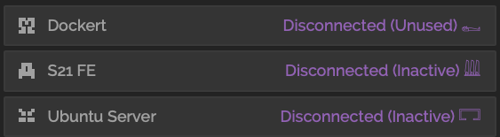
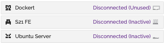
Connection type:
WAN
Disconnected
Relay
Quic
LAN
(PS - The bars-icons are not on the emoji keyboard. These icons are for demonstration purposes only.)
Seeing the icons in a legend on hover tooltip explains the user exactly what they need to know about 2 to 10 seconds after wondering what this all means.
Between setting up protocol listen addresses, toggling NAT and Relaying, I think it’s fair to assume that people installing Syncthing tend to be above average technical. The terms WAN and LAN are written on the router. Most households have one person that was instructed to “connect the modem to the WAN port” (and the NAS to the LAN port). If we choose to assume a target audience that doesn’t know this jargon, Syncthing may have bigger issues.
2 Likes
Tooltip in this case is problematic, because the icon is essentially a part of yet another interactive element. This makes the tooltip show, e.g. when you want to just click the device title to open the details, which I personally find annoying and not the best in terms of user experience and aesthetics (on a side note, the same applies to the similar tooltips that show folder IDs in the folder list).
Edit:
If I remember correctly, the conclusion was to move the information from the tooltip to the newly added “Connection Type” entry in the unfolded device info, making the tooltip itself redundant. Is what’s shown there not enough?
I really can’t agree with this. I’ve myself installed and helped set Syncthing up for many people whose knowledge about computers is minimal. While the initial configuration was indeed done by myself, they do continue to manage it on their own. For those users, showing too much technical information on the main screen in the GUI can make things confusing very quickly.
Also, while on the desktop it does seem that Syncthing is used mostly by technical people and power users, there also appear to be many who install Syncthing on Android with no technical background, simply by finding it in the store when they search for a file sync tool.
In the end, I just believe that there needs to be a good balance between technicalities and user friendliness here  .
.
1 Like
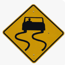
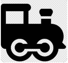
What about vehicles or animals?
disconnected → relay → WAN → LAN
red resting donkey → yellow locomotive → blue plane → green rocket
red Oyster → yellow turtle → blue rabbit or smthing else → green running horse
Or tachometers :
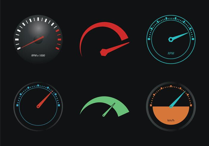
1 Like
That relates to speed (of a transfer?) while, as shown above, the quality metric we define the ranking over is actually network distance and not necessarily (though typically) related to speed.
1 Like
I created an issue for the LAN detection:
2 Likes
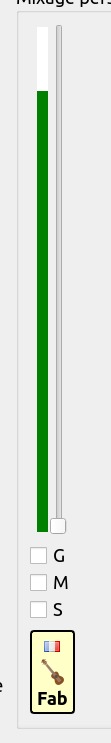
Yes, you’re right André, sorry, I didn’t read the whole thread. So, as using colors seems to be an issue for some, what about a number of stars like for hotels (4, or 5 to distinguish TCP vs UDP if this ever makes sense, the first one meaning disconnected being a broken star). Or a text-only quality ratio e.g. 3/5. Or either, keeping the current indicator design, although rotated 90°, a vertical scale, but all bars being of same length*…and keeping the current idea of small dashes showing all available steps.
I try ascii art below for the later:
-
-
-
-XXXXXX
-XXXXXX
Some kind of digital VU-meter
A generic tooltip would say something like ‘Overall connection quality, not throughput related’ to prevent forum spam requesting the meaning 
* this would prevent confusion with wifi/cellular bars, which are also looked as throughput quality… while they actually are not.
Yet another great FOSS (Jamulus):
1 Like
What I meant


1 Like
That’s what I imagined from your description
Not any better than the current bars though IMHO. It would raise many more questions because of the uncommon pictograms. If I had to guess without further info, I’d associate this with the disk usage on the remote device.
1 Like
Not so uncommon in my opinion: What the heck, since when does my homeserver have a battery? And it’s dead?!
2 Likes
Yes, hieroglyphs are definitively out of date. Did you ever try to build an Ikea piece of furniture 
Whatever, let’s try again

1 Like


Or textual symbols
DISC POOR WEAK STRONG LAN
1 Like
On the other hand they are not likely to be associated with any pre-existing meaning in Syncthing nor confuse people with their WiFi. I propose
𓀿 (death) for Disconnected
𓉐 (house) for LAN
𓇏 (field of reeds) for WAN (what you might find outside the house)
𓈉 (foreign land) for Relay
though there might be a small risk that they’re not present in everyone’s font setup
2 Likes
I suppose on older mobile devices/browsers this is more of a significant issue.
Besides, I’m not so sure this approach works well. These hieroglyphs don’t really seem to be user/ui-friendly.
Some quick-and-dirty tests:
Feels more like an accidentally partially printed icon than something with a meaning behind it.
So far it seems like we could benefit from a direct documentation-link in the details-panel where we explain what the icon represents and, more importantly, what it doesn’t. Different icons don’t seem to improve the situation significantly, imo.
1 Like
Yeah, I think I was joking with that suggestion…
This is my conclusion as well.
3 Likes
So far, all the suggestions in this thread are not real improvements. They either look worse or don’t make things more understandable to the user.
Apart from the hyroglyphs, which are a good candidate for an Easter egg 
I think we should keep things as they are for now.
1 Like