Awesome start Just loaded it up, comments as I find them.
Don’t take these as a criticism - they’re likely all issues in the mockups that you’re using. You often don’t see the issues in a mockup until you try and implement it. Others will simply be a matter of polishing, which you haven’t got around to yet.
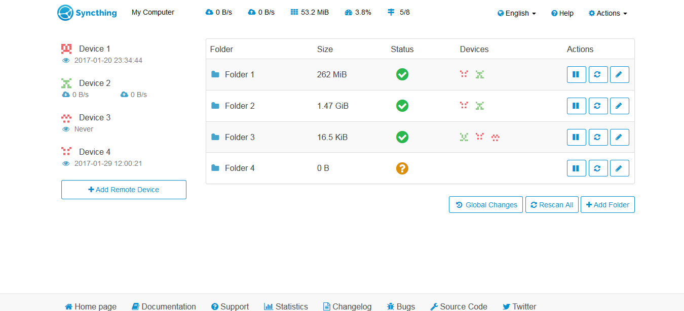
The bottom bar (with ‘Home page’, etc, on it) doesn’t sit at the bottom of the page.
It took me a while to notice that the stats for my local device were right the way at the top, alongside the menu. Might be nice to bring these down a bit? The mockups I saw had more whitespace around them, which makes them stand out a bit more.
It doesn’t work well on mobile.
We’ve lost a lot of info both about the devices and about the folders.
The ‘Last Seen: Never’ isn’t very obvious - it’s just an eyeball with ‘Never’ next to it.
‘Add Folder’ lost its little Plus icon.
Folder IDs aren’t displayed for me, oddly. I haven’t dug into why.
The ‘Devices’ icons work really really well. Awesome!
The popup when you mouseover the folder size can wrap in an awkward place: I see 17 <LINEBREAK> directories for example.
The popups over the icons to do with ‘my device’ aren’t particularly clear: the ‘up’ and ‘down’ popups just show the total data transferred, without saying that that’s what they’re showing. The others don’t show anything. It would be nice to display exactly what the icon represents (CPU, memory usage, etc).
We’ve lost the ‘global discovery/etc’ icon for ‘my device’.
There’s no way to get at the extra info for folders and devices - what address the device has, for example.
Once again, thank you for putting this effort in! It’s got a little way to go, but it’s simply fantastic that someone’s making this old dream a reality!
Hey,
thanks for this very comprehensive feedback.
Some things are easier to fix, others are very hard:
I intentionally removed the “fixed” setting at the bottom bar, because I think it looks better if it’s not always present. I think it depends on people’s taste
At the mockups the menu has been moved down and has been cleared (e.g. the language selector has been removed). I think that the stats should be placed in the menu bar, because otherwise you have kind of two menu bars (one with the menu and one with the stats), what wastes space and makes it look more complicated. In a revision I inserted a little whitespace to the left element, so it stands in the middle now.
Agreed. Didn’t test it, because mobile was not my priority and I suck at mobile developing :-/
That issue is subject of discussion: I think too much info kills simplicity. Maybe there should be more info available in a modal which opens if you click e.g. an info button?
Agreed. There will be a tooltip with “Last seen” text in the next version.
The Plus icon was intentionally left out, because I thought that not every button needs an icon. Since I didn’t remove the icons from all buttons it’s not how it should be, so I inserted it again.
Thanks to @Alex I created a fallback to the ID if the label is empty.
Thanks
Changed
I added info tooltips to the icons without description. I also added the text Upload/Download rate and “transferred”
I really like how your mod looks - thanks for your work.
Three minor points:
I don’t really like the moving progress bars. I generally am not a fan of animations and I have a device that remains out of sync due to ignores - so the animation stays forever.
The global changes link looks a little out of place. Everything else is a button. And it is closer to the “Add Remote Device” button than this button is to the devices, while it a separate function.
A popup on mouseover describing the folder actions would probably be good. Edit and pause symbols are clear, but scan not necessarily (refresh?).
About canton7’s points 4 and 12:
Maybe just do it the way it is done in the old GUI: On click expand the folder/device entry towards the bottom displaying the additional info.
Wow great work Luke! I’m the designer of this UI and I am extremely happy that someone took the time to implement it.
I haven’t tried it out yet but I thought I’d start by just giving you some quick comments based on the screenshots but I plan on trying out the mod later.
These are my main comments at the moment:
It would be good to increase the padding a bit for the table to match the one in the design and make sure it is even for top and bottom.
Text in the table, icons and buttons should all be centered vertically.
The action buttons should be even in height and width
Add the syncthing blue color to the folder icons and the local device icons up top. And also the buttons if you want to follow the design strictly
Add slightly rounded corners like 4px to the table and buttons
That’s it for now. Keep up the good work and again I am really happy to see this become a reality after all this time. Feel free to reach out to me if you need any help or have any questions.
If you’ve got the installed version, follow the same instructions as for normal syncthing. If you’re using the portable version, you’ll want to extract the zip into the ‘data/syncthing’ folder instead.
I’m more than glad to talk to the original creator of the mockups. You did a great job!
You pointed out some issues that make the GUI look even better. At some things I wasn’t sure to find out what the issue was that it doesn’t look that well (e.g. the vertical centering).
It would be good to increase the padding a bit for the table to match the one in the design and make sure it is even for top and bottom.
Do you mean the padding of the cells?
Do you have any idea for presenting the advanced device/folder info?
For me the blue text in the buttons looks weird, I would prefer them black as all the other text in the top/bottom-bar and tables.
The symbols in the action buttons are not centered and the box is not quadratic (purposely?).
Why are Pause and Edit button on devices only appearing on mouse-over? Imo the available options should be visible without poking around with the mouse. Related: The device entries shift vertically on changing mouse position (e.g. moving mouse from lower device to upper shifts the lower one down).
Text in all the “normal popups” (e.g. on status symbol) is not centered.


 Just loaded it up, comments as I find them.