UI confusion as a new user

Yes, you’re right. My bad.

Where I’m coming from: We’re using syncthing to share a folder between users. So I didn’t set up the initial device. I don’t know anything about it. (save the IP address)

Here’s some things to start.

  1. Have an installer. Don’t make me figure out where to put it. Every OS has it’s ideal locations for applicatiosn. Particularly given that this one is a service. The installer should optionally set up the service.

  2. Provide a default configuration in install so that the user has time to figure out the necessary elements of the interface. Setting up the user’s first device, the device ID should auto-populate from the “action command” that’s listed above.

  3. Calling something an “ID” is unclear. Particularly it feels like it’s an official thing rather than an informal thing like a name. (Particularly when you ask for both a name and an ID). As a user I was

“Where do I find the ID”? “Do I just pick an arbitrary value?” “Is it some form of UUID that I need to generate?” “How do I generate an ID?” “How do I know it’s the right ID?”

  1. Let me decide where the folders are going to go initially. This is a reasonable first configuration requirement.

When the default configuration is first set up. Placing where the content goes is like the #1 thing that a user would want to go and yet it’s the one thing that the interface doesn’t allow you to do. You have to mess with configuration files.

These are just a few things off the top of my head. The issue isn’t unique to this project. The best open source software has the worst interfaces because “committee design” eshews the the most important quality: Consistency.

Now I have to figure out how to get the default directory back because I deleted it because I wanted to change the local location. It seemed to have randomly added it self again the first time I tried setting this up… not sure why it isn’t again.
Take a look at the community contributions - SyncTrayzor and Syncthing-GTK, for example, both provide installers.

We already set up a default folder. I’m not sure what you mean by “Setting up the user’s first device, the device ID should auto-populate from the “action command” that’s listed above”. Do you mean the first time that the user adds another device? I’m not sure how we can auto-populate anything in that case, since we need the user to tell us the Device ID of the other device.

Fair. The text underneath both the “Folder ID” and “Device ID” does go into some detail on what exactly that field represents. Do you have any suggestions on how to improve it?

You can create new folders straight away. Is this not what you were expecting?

What did you have to edit the configuration file for? As a user, you should never have to edit it manually.

So, Adopt one as the project standard.

Understand where I’m coming from. There’s already an initial host somewhere. So when I’m adding my device, I’m a secondary user. I’m adding my device to the network. So when I first add my local device (not the remote one), I still have to add my local device with the “+ Add Device” button. Why not autopopulate that ID from the local host?

The device ID at least tells you where to go find the Device ID under “Actions > Show ID”.

But with the Folder ID. you’re left hanging. You’re left wondering if you’ve chosen the right name or if it’s suppose to be some sort of UUID that is generated like the Device ID.

Sorry, we’re sharing the same language for two different concerns. I’ll use “directory” when I mean local hard drive folder.

When my administrator authorized my device it added a new Syncthing folder called “default” but as a user, I wasn’t able to specify the local directory where the Syncthing folder was to sync to.

I have a D drive for data. My C drive is a smaller SSD that I don’t want to populate with data.

I ended up deleting the folder with the hopes of re-adding it with a new local directory path but now I’m worried that if I add it with the same (syncthing) Folder ID, I’m going to accidentally wipe out the server folder directory. (it’s probably not set to “master” because I’m expected to contribute to the folder).

After looking on this forum, it seems the only way to change the location of the local directory for a Folder is by modifying a config file. This is bad UX.

That’s fair, and has been a point of discussion for a long while.

I’m still confused as to what you’re trying to get the UI to do. Let’s start from the beginning. You have an existing device, let’s call it “Device A”. I think this is what you called the “remote” device. Now you’re just installed Syncthing on “Device B” (your “local” device, I think).

In order to get the two devices to talk, you need to go to Device B, click “Add Device”, and paste in the Device ID for Device A. Device B doesn’t know the Device ID of Device A yet - that’s why you’re adding it: therefore I’m not sure what we can autopopulate.

From what you’re saying, it sounds like you want to add Device B to Device B. That doesn’t make sense - why do you want a device to talk to itself?

I should add, there’s a very thorough Getting Started guide at Getting Started — Syncthing documentation, which is also included as a PDF when you downloaded Syncthing.

That’s fair. There have been recent changes around this, so it’s probably worth waiting until those are released before discussion this much further.

As described in the guide, Syncthing is a tool for sharing folders with other devices. You say your administrator authorized your device: what exactly do you mean by this. Do you mean that he shared a folder with you? What was the ID of that folder?

Click ‘Add Folder’, set the ‘Folder ID’ field to the ID of the folder which your administrator shared with you,set the path to whatever you want, and make sure it’s shared with your Administrator’s Device. In fact, Syncthing should have prompted you to create a folder with the correct Folder ID when your administrated shared it with you

You dug up a thread which described a different issue, and which was almost a year old.

Imagine how I feel. I just started using Syncthing yesterday because my admin said this is how we’re sharing builds between us. I know nothing save that it appears to be a decentralized “cloud-like” service that keeps directories synced using what’s clearly a superior data propogation method (I’ve never seen data download so fast).

Sure. Sounds good.

“Add Device” is for remote devices??? Why not call it “Add Remote Device”? There are two device in question “local” and “remote”. There’s nothing in the interface that disambiguate them.

I thought I had to add my local device to a sharing network specified by a root sharing device defined by the “Address” section of the folder.

I literally thought the “Add device” was “pair my device to a remote one” where I needed to specify my device id to a server specified by the address that I had to provide.

If you have ot point someone to the documentation, the interface has already failed.

There’s nothing terribly complicated in principle about this system. Setting it up should be trival.

I mean I set up my Dropbox and my Google drive in seconds without documentation.

Now granted this is decentralized rather than cloud service but it shouldn’t be that much harder.

If you have a better way to achieve this without compromising on security, we are all ears. But from we’ve seen so far, people who tried to make suggestions to this, either ended up suggesting the same implementation just with a different name (pair computers), or compromised on security.

That’s a fair comment. There is whitespace, but it’s not immediately clear.

The UI by @gilli removes the local device box all together, which should solve the confusion, if ever implemented.

You could add the concept of “groups” and “public” to the cluster. So that if someone adds a folder to a group or marks a folder as public.

And how is introducing two more concepts/terms make the UX better?

I’ve not taken part here in a while! But why not include something like Shephard on first run to guide the new user through the interface? This would solve a lot of confusion for users similar to @majeric.

http://github.hubspot.com/shepherd/docs/welcome/

You could also include links to GUI wrappers on the main Syncthing UI, not sure if this would help any.

This is all well and good but when you have a user that doesn’t want to read something such as the getting started documentation then what chances do you have that they will read the links to GUI wrappers or even the client-side tour…?

1 Like

To summarise the points that we managed to identify:

  • Syncthing, as it is distributed now, is not friendly to beginners. Wrappers exist, but they’re hard to find unless you know to look.
  • The concept of a “Folder ID” is unclear, and isn’t explained well. The new work around separating folder names and IDs may impact this in a positive way.
  • The “sharing model” used by Syncthing is not clear to someone who has not read the Getting Started guide. The UI does not help: unless you know that you have to ‘Add Device’ to create a link between your device and another, and then share folders with that device, the UI does not guide you towards that conclusion.
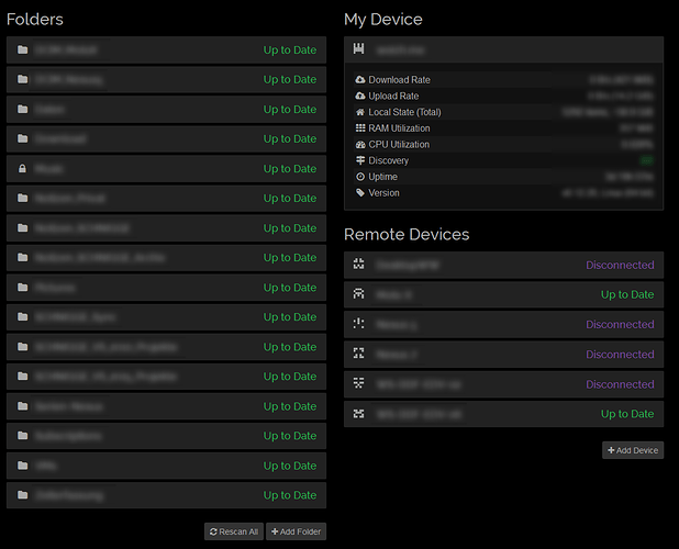
  • There is not a clear separation between “My Device” and “Devices which I’ve added” (fairly different concepts) on the right-hand side of the UI.
  • The default folder may do more harm than good: users try to change where it points to, or change its ID, when in fact (most of the time) they need to delete it and start again.
  • It is not clear that a folder cannot be relocated, or its ID changed (other than those fields being disabled, but it’s not clear why they’re disabled, or what should be done about it).
  • Users feel that they shouldn’t have to read the Getting Started guide (even though it’s included in the download), and blame the tool for not being clear enough when they should be reading the docs. This brings into question the value of the Getting Started guide.

Thoughts:

  • We should probably revisit how we guide new users towards a download that’s appropriate to their platform and skill level (#2846).
  • I think it may be better to leave the list of folders empty to start. If no folders are present, display some text explaining what a folder is, how folders relate to devices, and how to add one. Likewise with the device list: if it’s empty, explain what a Device is, how Devices are added, and how Devices relate to Folders.
  • The list of Devices could do with some grouping. Perhaps display “My Device (DeviceName)” in the title for the box for the current device, and put the others in a group with an appropriate title (#2849).
  • Better help text around the Folder ID.
  • Explain why the Folder ID and Folder Path can’t be edited when editing a Folder.
  • Consider using a tour, per @Rewt0r’s suggestion.
3 Likes

Saying “I didn’t want to read the Getting Started guide” is one thing, but I think it’s much harder to justify “I clicked through the Quick Start Tour because I didn’t want to read it, and now I’m lost, but I don’t want to go through the tour again”.

1 Like

I would suggest just changing the current headline to “My Device” or “This Device” and adding one before the other devices panel group “Remote Devices”. Something like that:

3 Likes

Looks good, please file a PR/ticket.

Very nice! Minor nit: reword “Add Device” to “Add Remote Device” (or whatever, to match the title of that section).

Will do.

Canton7 said:

Users feel that they shouldn’t have to read the Getting Started guide (even though it’s included in the download), and blame the tool for not being clear enough when they should be reading the docs. This brings into question the value of the Getting Started guide.

Hi world, this is my first post here, I’ll present myself after, in a new topic. For now I just wanted to breathe the air around by reading a post that could interrest myself. A comment to quoted canton7 above : well I didn’t yet installed syncthing, but I think I had a fair overview of the Getting Started Guide, more than a lot of users will do. Not being fully sure there is a difference between the “standard ?” GUI, i.e. the user web brother or optional GUI (like gtk or others), may I suggest that GUI fields or info zones are linked to relevant parts of the GSG via tool tips or html links. This would act as a online help. As a super bonus, an option for advanced users would allow to hide/disable this help. Whatever, please don’t delete the GSG : it is a good thing for those who want to understand a bit before to play. Thank you all for your great job

1 Like

They are well established UX concepts? People understand the concept of privacy and anyone who’s ever shared another folder with someone appreciates that.

A part of “consistency” is using established models that people know. Anyone who’s used dropbox or google drive should immediately “get” this tool.

Now I appreciate that there additional constraints defined by a decentralized cluster but this isn’t one of them.

The reality is that both Google Drive and Dropbox don’t require documentation for the user set up.