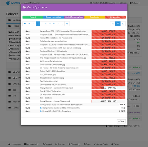
I’m working on reordering the pagination buttons for the out-of-sync lists.
Due to the window and font dynamics the ‘next’ and ‘previous’ buttons tend to move which is a little but frustrating 
So I moved the pagination to the top, changed the button characters to nice arrows. Now they are at fixed positions and it’s easier to click through. Not perfect, but on its way 
Now you can click-click-click-click-click through the pages.
I modified
gui/default/syncthing/transfer/failedFilesModalView.html
gui/default/syncthing/transfer/neededFilesModalView.html
gui/default/vendor/angular/angular-dirPagination.js
but I desperately fail on
gui/default/syncthing/transfer/remoteNeededFilesModalView.html
due to my ignorance of learning how to code in javascript… there are some arrays and other magic stuff …
I’d also like to move the close button to the top, since it disappears when the list get too long.
So… if this new layout would be accepted, is anyone willing to help me ‘fix’ remoteNeededFilesModalView ?
Is it OK to modify files in ‘vendor’, or do I have to create pull requests upstream and wait until they accept and pull ?
