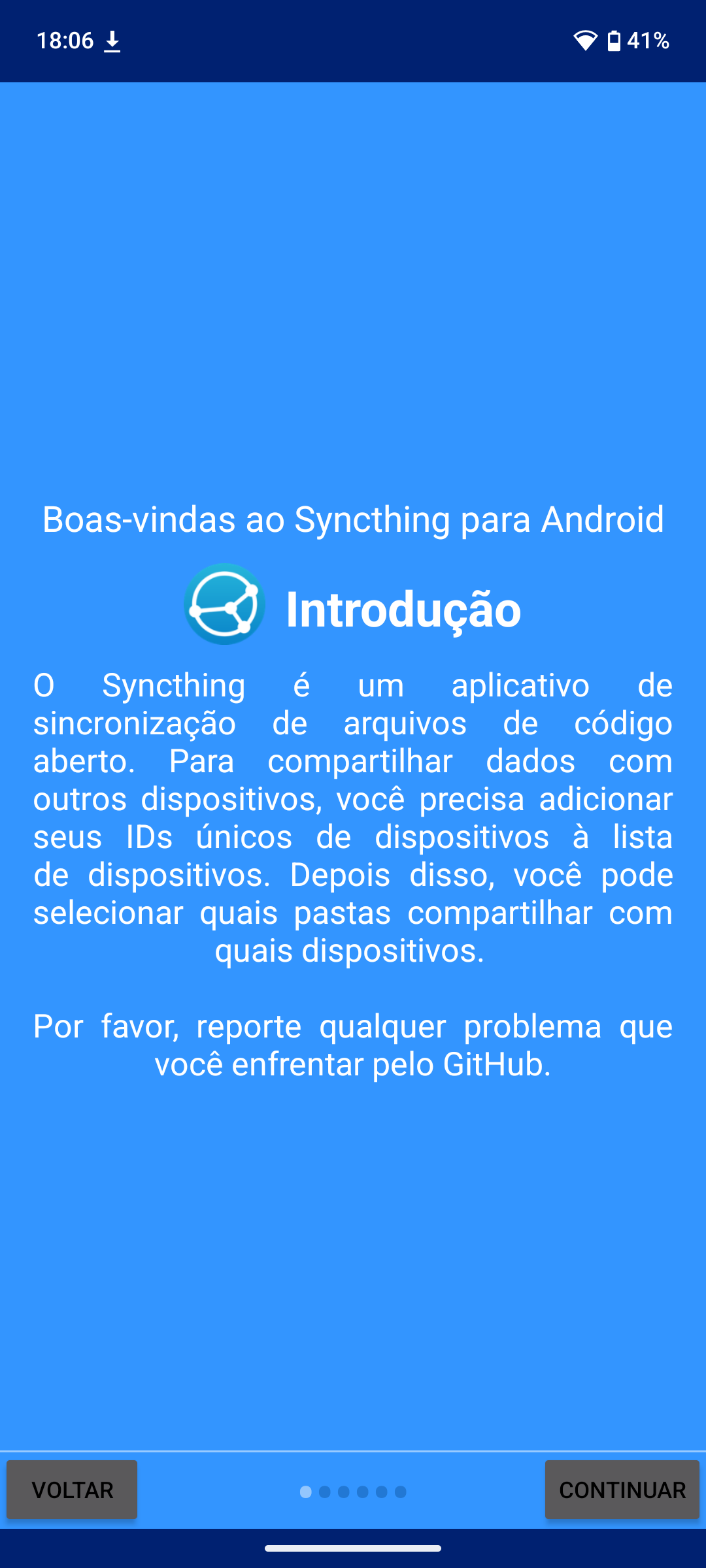
Currently I notice that the text in the introduction menu in Syncthing-Fork seems to be justified (had to look in LibreOffice to know what it was)? It looks really off, it kind of makes it hard to read.
Syncthing-fork never really looked as good as the deprecated Syncthing client unfortunately
This topic was automatically closed 30 days after the last reply. New replies are no longer allowed.