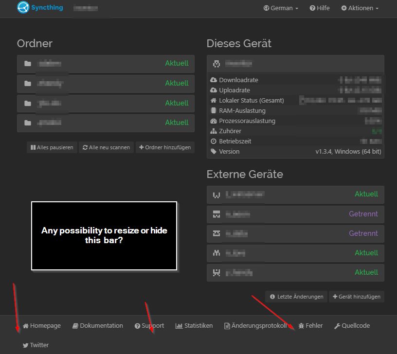
H there!
Is there any way to resize or hide the bottom link bar? It often interferes on my devices because they all use different resolutions and i have to resize the Synctrayzor window every time.
Thanks!
H there!
Is there any way to resize or hide the bottom link bar? It often interferes on my devices because they all use different resolutions and i have to resize the Synctrayzor window every time.
Thanks!
Yes, with custom CSS. This is what I do.
.navbar-fixed-bottom {
	position: static !important;
}
This way the bar is still present and visible at the bottom of the page, but does not hover the screen.
See https://docs.syncthing.net/users/faq.html#i-don-t-like-the-gui-or-the-theme-can-it-be-changed.
There are no more detailed instructions, but what you essentially need to do is just to create a folder like gui\newtheme\assets\css in your Syncthing folder, then a text file called theme.css, and then copy and paste the aforementioned CSS code there.
After that, restart Syncthing and select the “newtheme” theme in Actions -> Settings -> GUI.
I don’t understand what exactly your css tweak does, but if it helps preventing the bottom bar from taking up unproportionally much space, sounds like a PR could be considered to add it to the default theme.
This CSS prevents the bottom bar from beeing fixed at the bottom. It will be directly below the content. If the content is higher than the window height, it’s not visible until you scroll to the end (which is preferable to the current behavior). BUT it will also be in the middle of the window, if the list of folders and devices is short enough (which is ugly).
The problem with potential overlapping is, that we think the footer is always 70px high and set the padding-bottom of the body to 70px. But depending on the screen width and the translation of the footer buttons, it is higher than that.
With modern CSS, like the vh unit and flex, we could build the GUI frame in a way that the footer is always at the bottom, but not fixed, so it goes away if the content needs more height. Bootstrap (especially the old version we use) has nothing built-in for this.
That would be fixable by only showing the icons for small windows with text in tooktips/all (i think we already do that in other places).
Unfortunately the width on which we would have to switch to icons-only massively depends on the translation. The English footer is 958px wide, the Korean footer only 749px while the Russian footer doesn’t even fit inside the full width (container width: 1040px).
Then we would have to always show only icons.
I’m not aware of any CSS-func that can set the padding of an element depending on the height of another.
Yeah, this is just a quick and dirty fix, which I came up with being annoyed by the bar staying on top all the time. I have a lot of folders and devices, so the above is not an issue here, but could be elsewhere.
I think that display: table and display: table-footer-group would be a good solution (and supported by older browsers), but is this actually the desired behaviour? My intention was only to provide a simple solution to this specific problem, not to change the default Syncthing layout  .
.
I do not like sticky elements in general, but this is just my personal preference.