Hi guys,
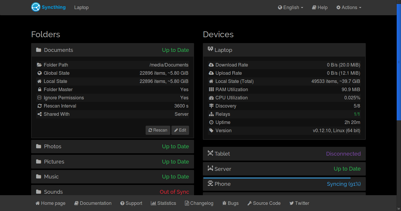
I made a white-on-black theme for the syncthing UI (screenshot attached), for use with the stylish add-on. The theme is available on userstyles.org.
I hope someone can find it useful or send suggestions to improve it.
6 Likes
Looks great, we should really add better theme support.
Yes, it’s great indeed! Nevertheless I would avoid absolutely black background preferring dark gray one. Then it can be default official theme 
Using it now. Great theme. I feel happier on the dark side…
Bravo. Well done.
Excellent. I am a great fan of dark themes. Installed it and it looks great! Thank you very much. I had been wanting something like this but am not familiar enough with css to create it myself.
You can easily edit the theme (your stylish add-on gives you the option of editing all your styles) - there is a dark background color at the top of the theme. You can experiment replacing that with “grey” or a hex number that corresponds to a color you like. You can find the number corresponding to a color for example here: https://duckduckgo.com/?q=color+picker+hex&t=ffnt&ia=colorpicker.
Just don’t want to make a browser depending on additional extension.
1 Like
So this is now part of Syncthing. One thing I’ve noticed wasn’t styled, was the tooltips when you hover on failed discovery servers for example.
1 Like
What does that mean? We’ll see theme choices in the next update?
Yes.
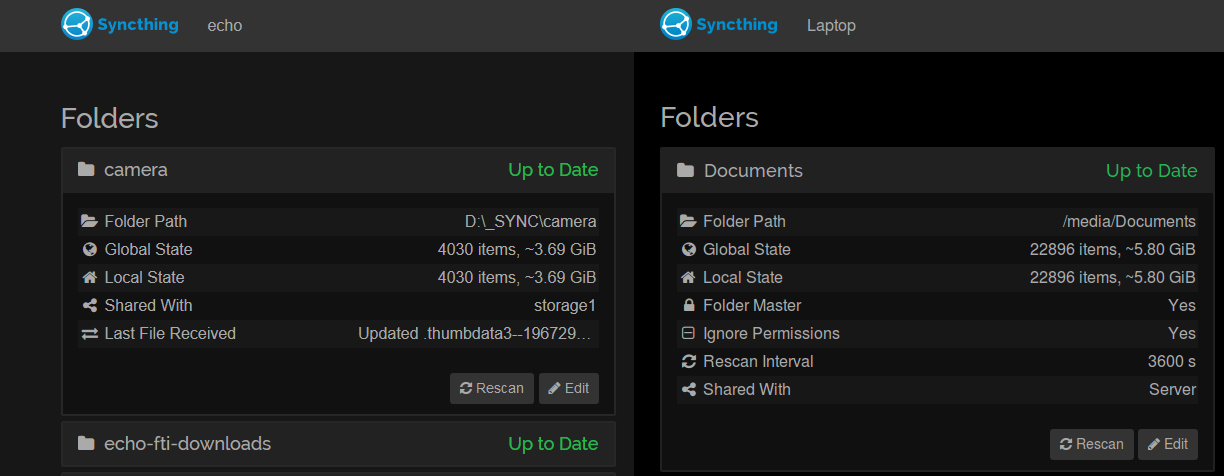
Here is a slight improvement for this Theme. (Increased Brightness for Background and Borders)
Complete Black Background is imho a little bit too dark… 
(Left: new, Right: Original)
--- stold.css   2016-01-11 18:30:08.464203355 +0100
+++ stnew.css   2016-01-11 18:42:53.156194436 +0100
@@ -2,7 +2,7 @@

   body {
         color: #aaa !important;
-        background-color: black !important;
+        background-color: #171717 !important;
   }
   a:hover,a:focus,a.focus{
         outline: none !important;
@@ -53,7 +53,7 @@
              border-width: 2px !important;
   }
   .panel-default {
-        border-color: #222 !important;
+        border-color: #272727 !important;

   }
   .panel-default>.panel-heading {
1 Like
@fti7, I share your feeling absolutely! 
I’ll adopt the changes, once the bikeshedding has converged. 
(Or in a day or two)
Well, if it were put to a vote, I like the dark one. The new one looks sun-bleached.
I’m glad my theme was appreciated and is now built into Syncthing
I personally prefer the full dark background, but of course anyone can make his own variations.
I would prefer the darker one as well. The slightly lighter one just feels “faded”.
There is a ticket for that:
I meant they are unstyled in the dark theme