Alright, let’s take this thing one at a time. ![]()
Alright, done:
No, there was a dialog. Sorry if I wasn’t clear on that point. My point is more that I don’t think Syncthing should have to restart on such trivial changes. It feels like upgrading Windows 98! (Okay, not as bad, but you get my point. ;))
I am not sure how to reproduce this. It happened only once, the first time I started syncthing. And this is on a fairly old phone (HTC One S, running Android 4.1). After restarting syncthing, the problem goes away.
I am not sure what a toast is, but before the restart, clicking the copy button wouldn’t do anything at all. It’s as if this whole dialog was broken.
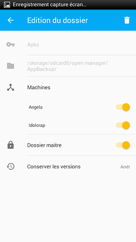
Oh boy… that’s the weirdest thing! I am just clicking the device button after editing a share… So this is what it looks like when i go visit a share (pardon my french :):
So far so good!
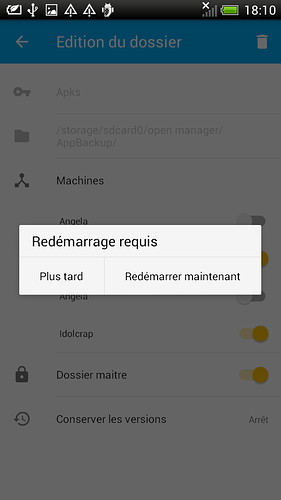
Then this is what happens when I toggle one of those machines (expected, I guess - notice the button is already duplicated behind there). I click “Plus tard” (later):
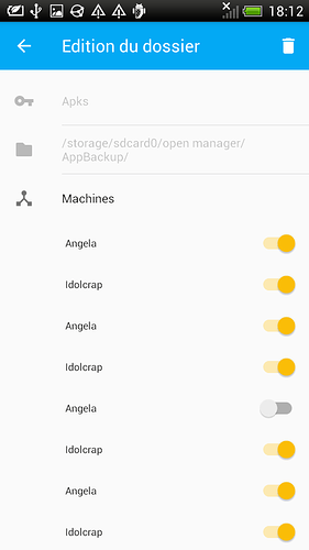
Then I get this nice mess:
Any time i click one of those toggles, they replicate like crazy!
Going in and out of the share fixes the problem. Obviously, this could be because this is a old version of android (4.1).
(I love it, by the way, that i could share those screenshots with syncthing as well!)
I do not. I have fairly little experience with Android, sorry I can’t help you there. However, I persist in saying that it would be quite useful to have a way to share single files. I don’t care how Syncthing does it, but from a user’s perspective, that was my requirement, and creating a folder was a bit too complicated.
Maybe a good solution here would be to have the following process:
- the user chooses “send to syncthing” on a file
- syncthing starts
- syncthing asks the user if the file should be added to an existing share or a new share be created, and which devices to share with (if it’s a new share)
- syncthing copies (or symlinks?) the file into the share
Done! That way the user doesn’t to learn so much about the Syncthing mechanisms before actually doing things, and is neatly guided through them. The user can quickly learn about shares and devices in a more intuitive way than being presented with all those things at once.
This is similar, mind you, with this feature request, although that one is specifically about sharing stuff with things outside of Syncthing.
Maybe this could help as well?
Frankly, I have no idea what’s going on there. I just know it took about 4 attempts to fill that up correctly. I am not sure what the file picker is: when i tap the field in the web interface, there’s a drop-down, but /storage was not listed there. Now I can’t reproduce that at all: presumably it behaves differently when creating a share locally or when accepting one? No clue.
The android app certainly looks better, but it’s obviously much harder to figure out if I don’t get prompted. ![]() So yeah, that issue seems like a priority item, definitely.
So yeah, that issue seems like a priority item, definitely.
I am glad it has been useful! Usability is critical in such grand public apps. I am glad the syncthing team is taking it seriously, and welcoming such feedback.
Oh and @wweich, glad to see some mysterious settings being hidden away, good job! ![]()
I hope that covers it all!


